
Case — Branding · Interior Design · User Experience
Children’s clinics.
A pediatric healthcare brand shaped around care, clarity, and a calmer experience for children and parents.
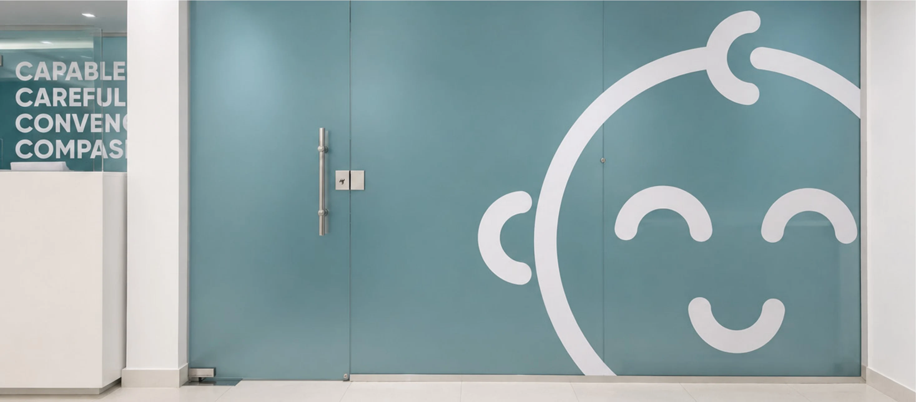

Children’s Clinics was developed as a pediatric healthcare experience designed to feel clear, caring,and reassuring from the first moment.
Alep shaped the identity and spatial experience around a simple idea: medical care for childrenshould feel capable and professional, but also soft, approachable, and emotionally safe.
Through a gentle visual language, calm colors, rounded forms, and friendly brand details, the cliniccreates an environment where children feel more at ease and parents feel more confident.
Design Narrative
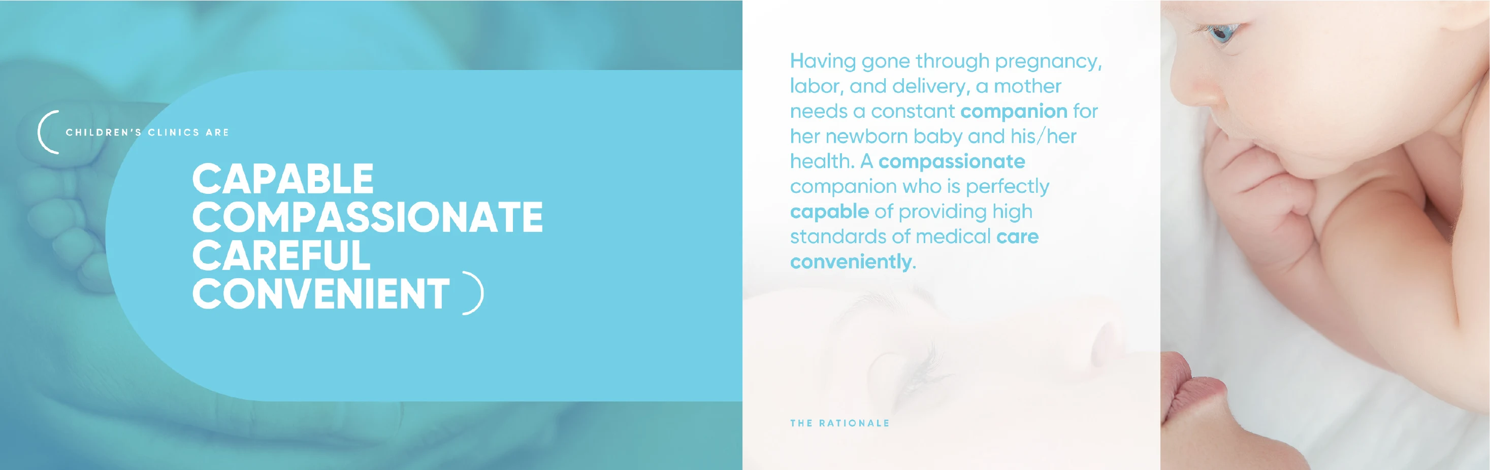
The brand was built around four core qualities:
Capable. Compassionate. Careful. Convenient.
These words became more than a message. They shaped the tone of the identity, the softness ofthe space, and the way the clinic communicates with families.
The baby icon, rounded graphic language, soft blue palette, and simple typography work togetherto create a healthcare identity that feels friendly without losing trust. The result is a clinicexperience that balances medical confidence with emotional comfort.
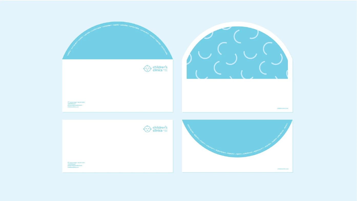
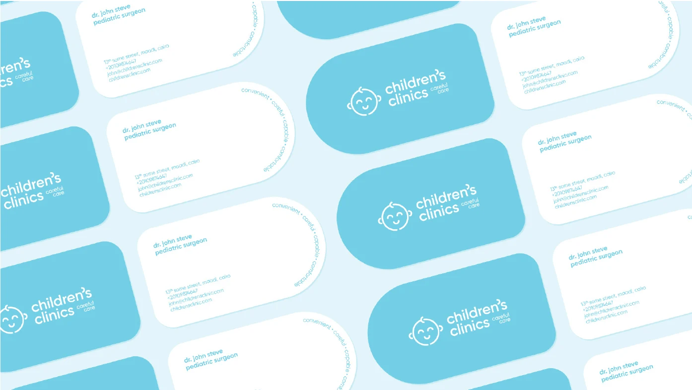
The Children’s Clinics identity was designed to feel simple, warm, and easy to trust.
Instead of using a cold medical language, the brand uses soft forms, a smiling baby icon, light blue tones, and clear typography tocreate a more approachable healthcare presence. Across cards, stationery, signage, and printed materials, the identity stays calm,recognizable, and parent-friendly.
The space
The space translates the brand’s gentleidentity into a calm clinic environment,using soft blue graphics, clear receptionareas, and friendly visual cues to makechildren feel more at ease and parentsfeel more reassured.
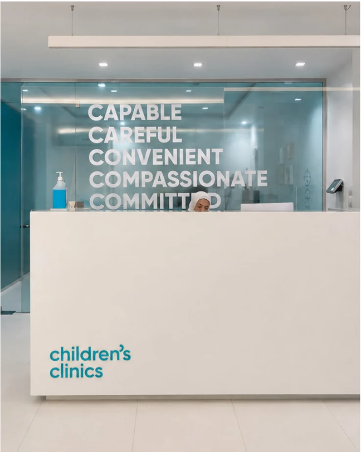
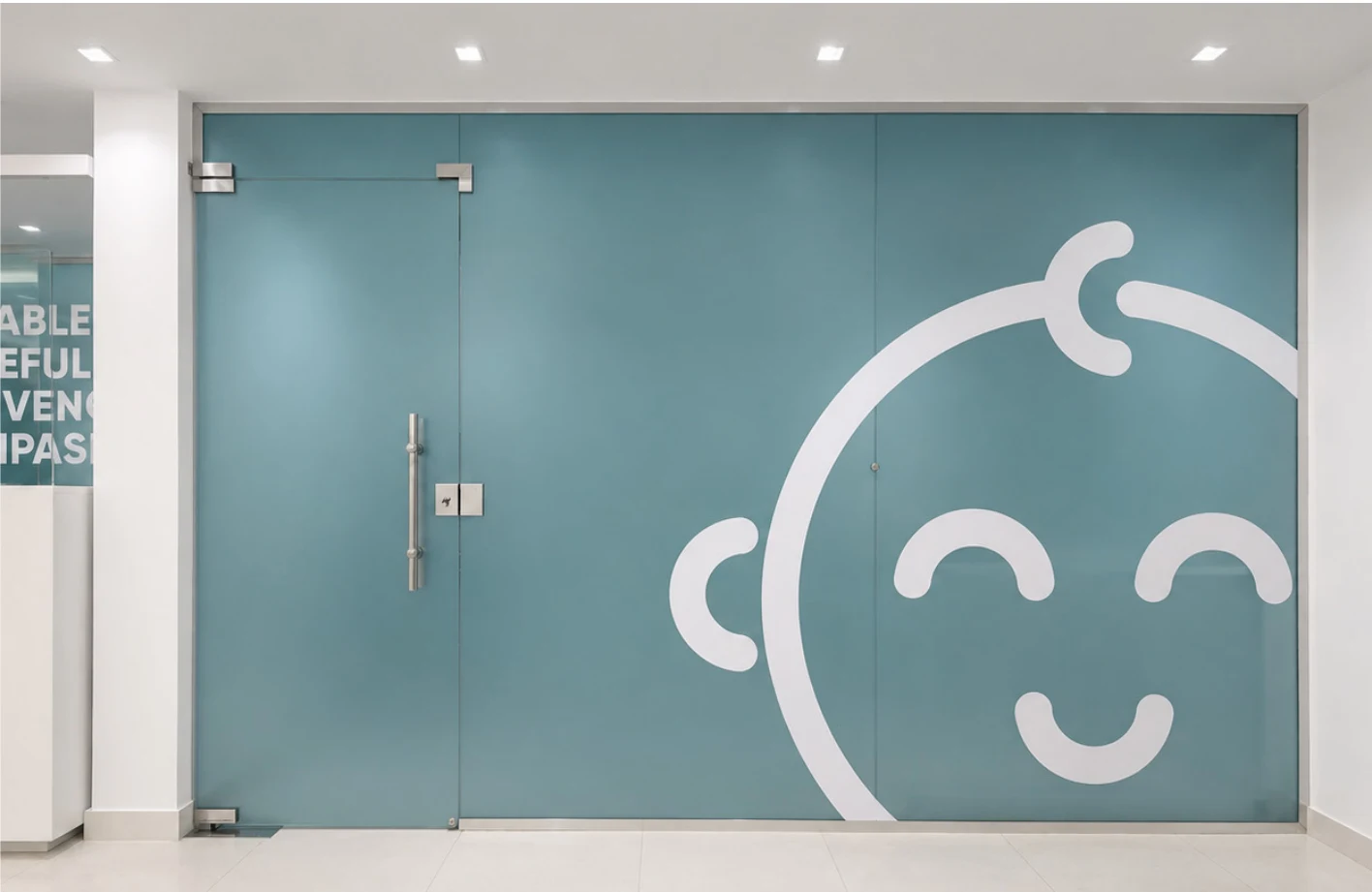
The clinic space translates the same gentle identity into a physical environment.
Glass graphics, soft colors, clean reception areas, and simple branded details create a calm first impression. The large babyillustration on the glass gives the space a friendly character, helping the clinic feel less intimidating for children while remainingclear and professional for parents.
Next case
Classi