
Case — Branding · Interior Design · User Experience · F&B
Nomad.
A specialty coffee brand built around adventure, movement, and a wider sense of community.
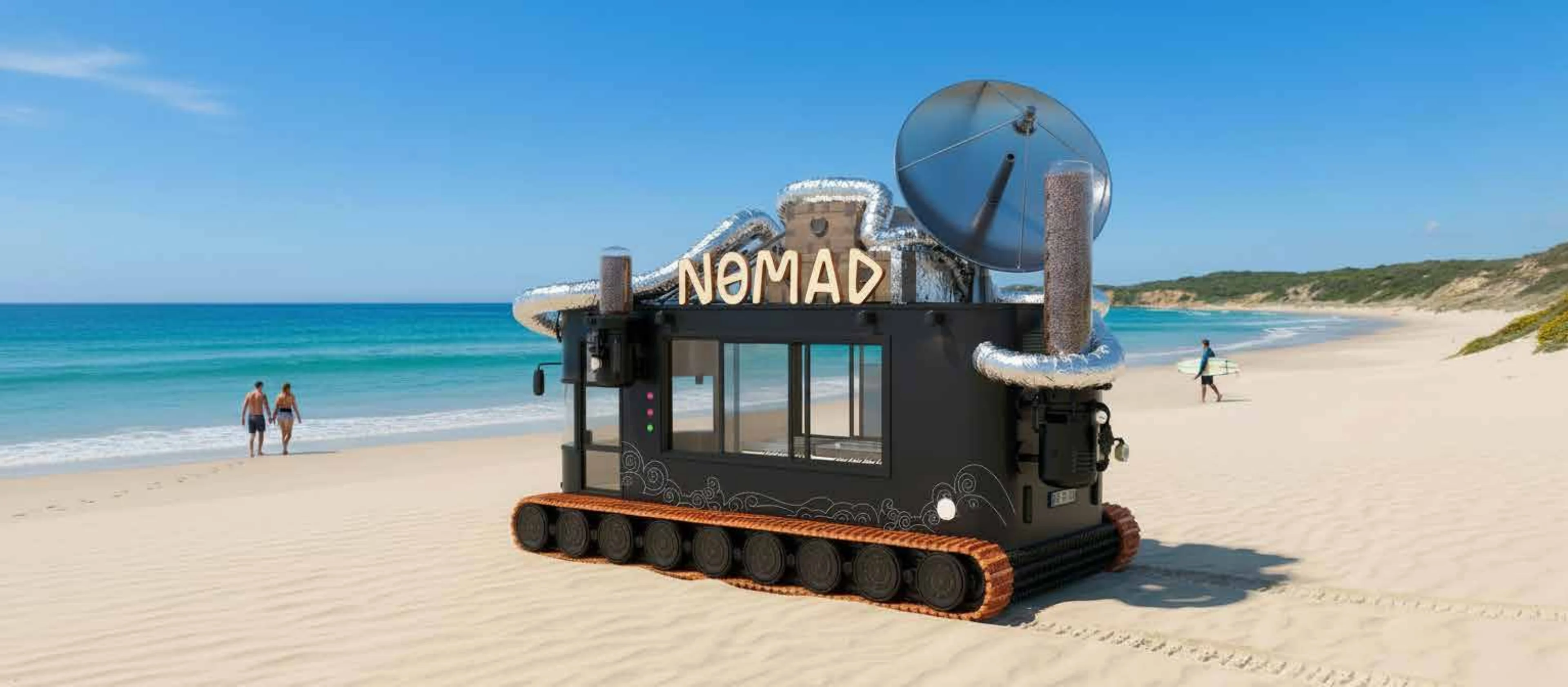
Nomad is a specialty coffee brand shaped around the spirit of travel, exploration, and everydayadventure.
Alep developed the brand identity and mobile experience around a simple idea: coffee can movewith people. It can appear by the beach, on the road, in a gathering, or in the middle of a day thatneeds a new rhythm.
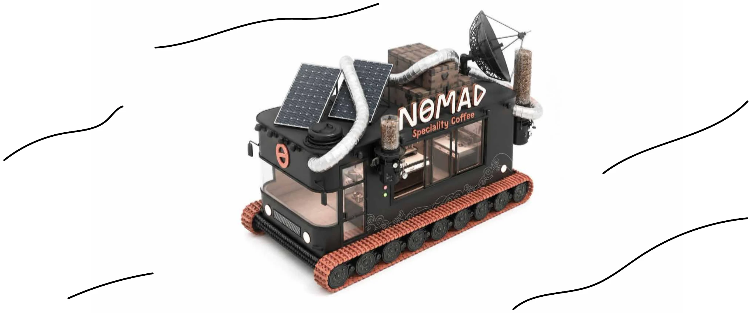
The brand was created as a complete world — a traveler, a machine, a visual language, and a mobilecoffee unit designed to bring the experience wherever people are.
Design Narrative
The experience is built around movement.
Rather than creating a static coffee shop, Nomad was designed as a brand that travels. Its visual identity, character, packaging,and truck all carry the same sense of exploration — turning coffee into something more active, open, and memorable.
At the center of the brand is Nomad, a character shaped by adventure and curiosity. He is not just a mascot; he becomes thespirit of the brand — carrying the machine, the journey, and the energy of discovery with him.
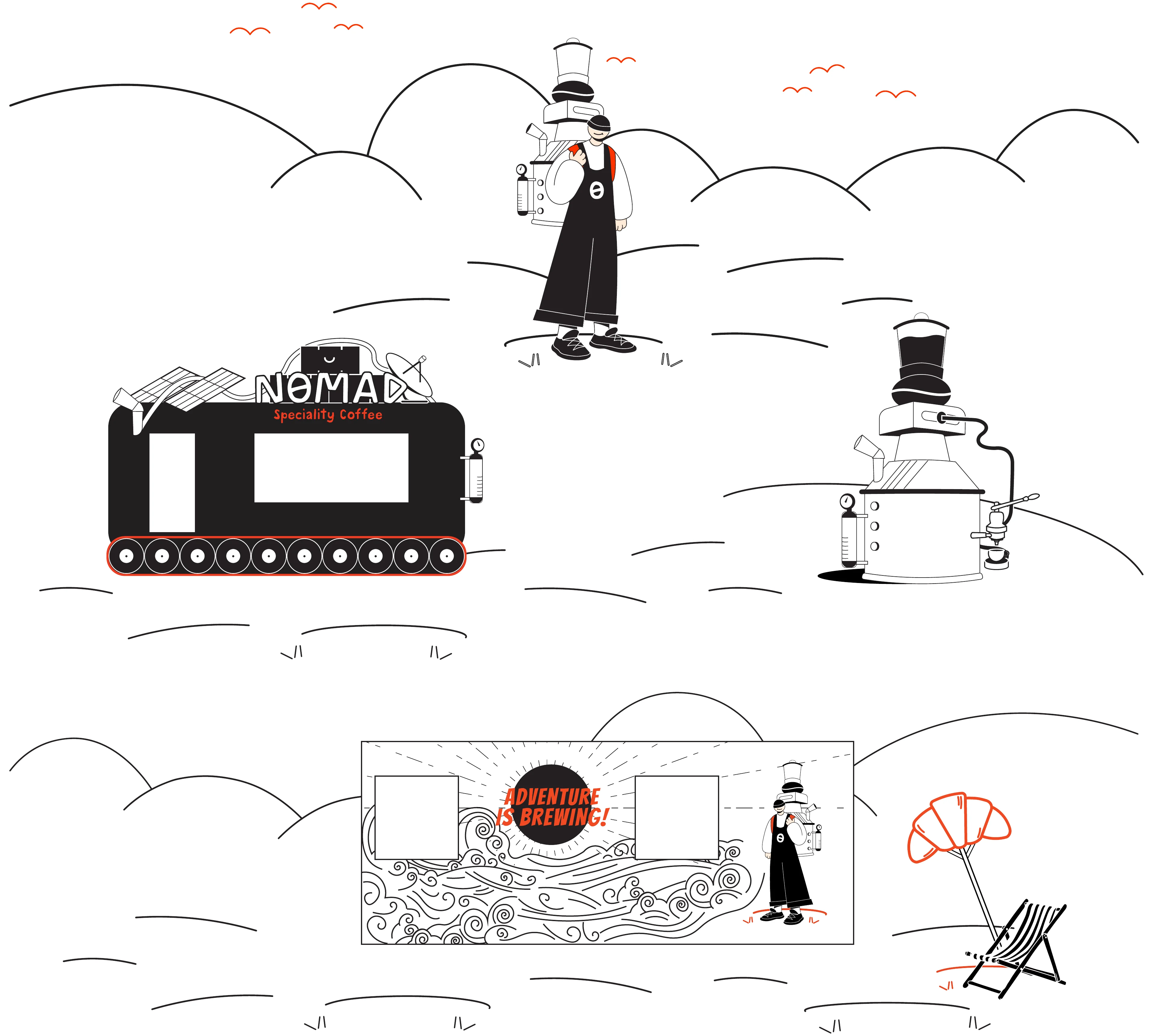
Nomad’s illustrated world brings the brand to life through simple lines, open landscapes, and playfuldetails.
The character, the coffee machine, and the surrounding scenery work together to create a world thatfeels light, adventurous, and easy to recognize.
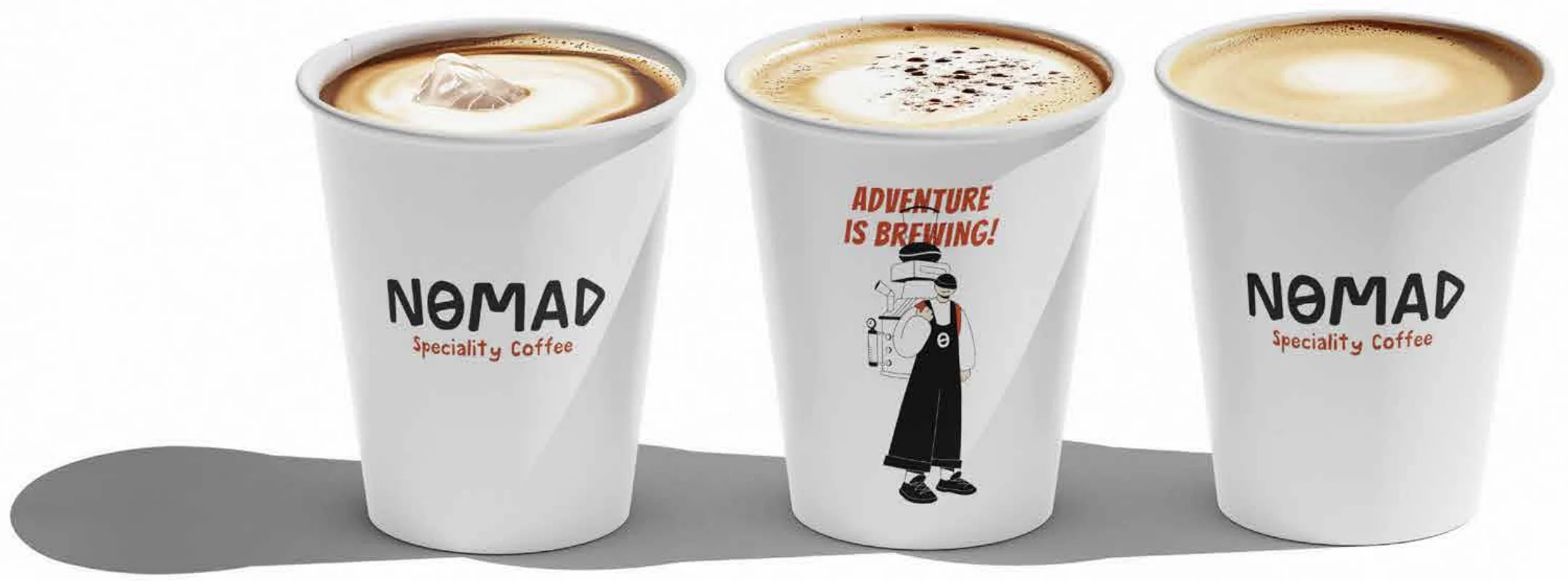
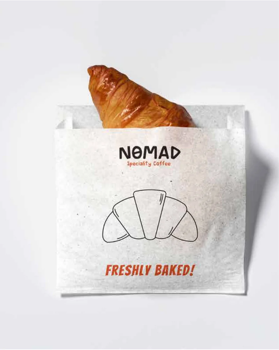
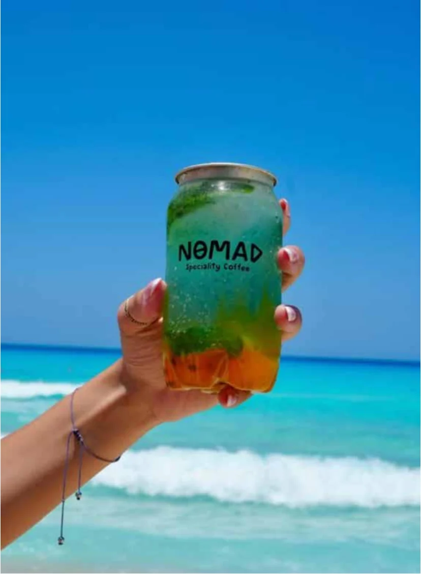
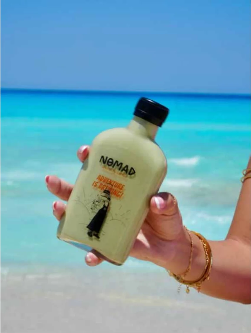
The identity extends across cups, bags,trays, uniforms, merchandise, and takeawayitems.
A restrained black-and-white system islifted by bold orange accents, giving thebrand a clear visual energy across everysurface. Whether on a cup, a bag, or at-shirt, the world remains unmistakablyNomad.
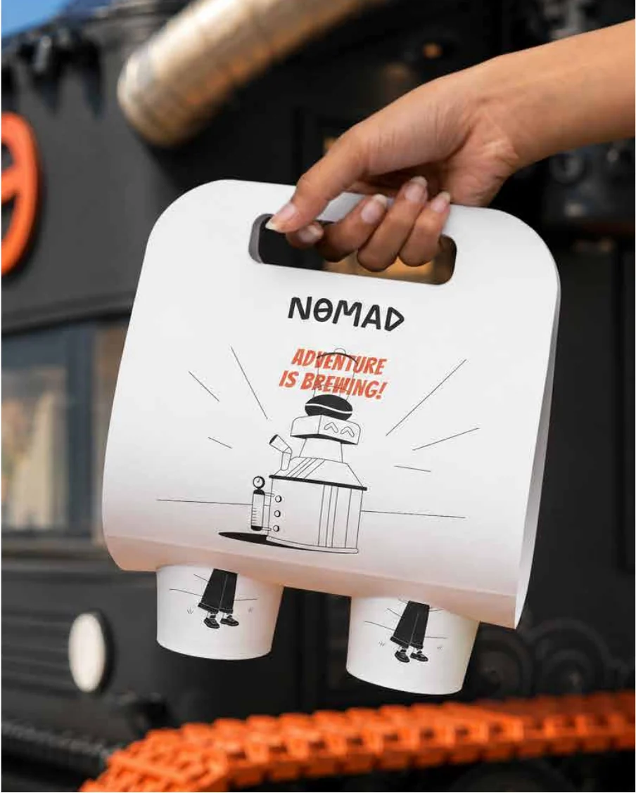

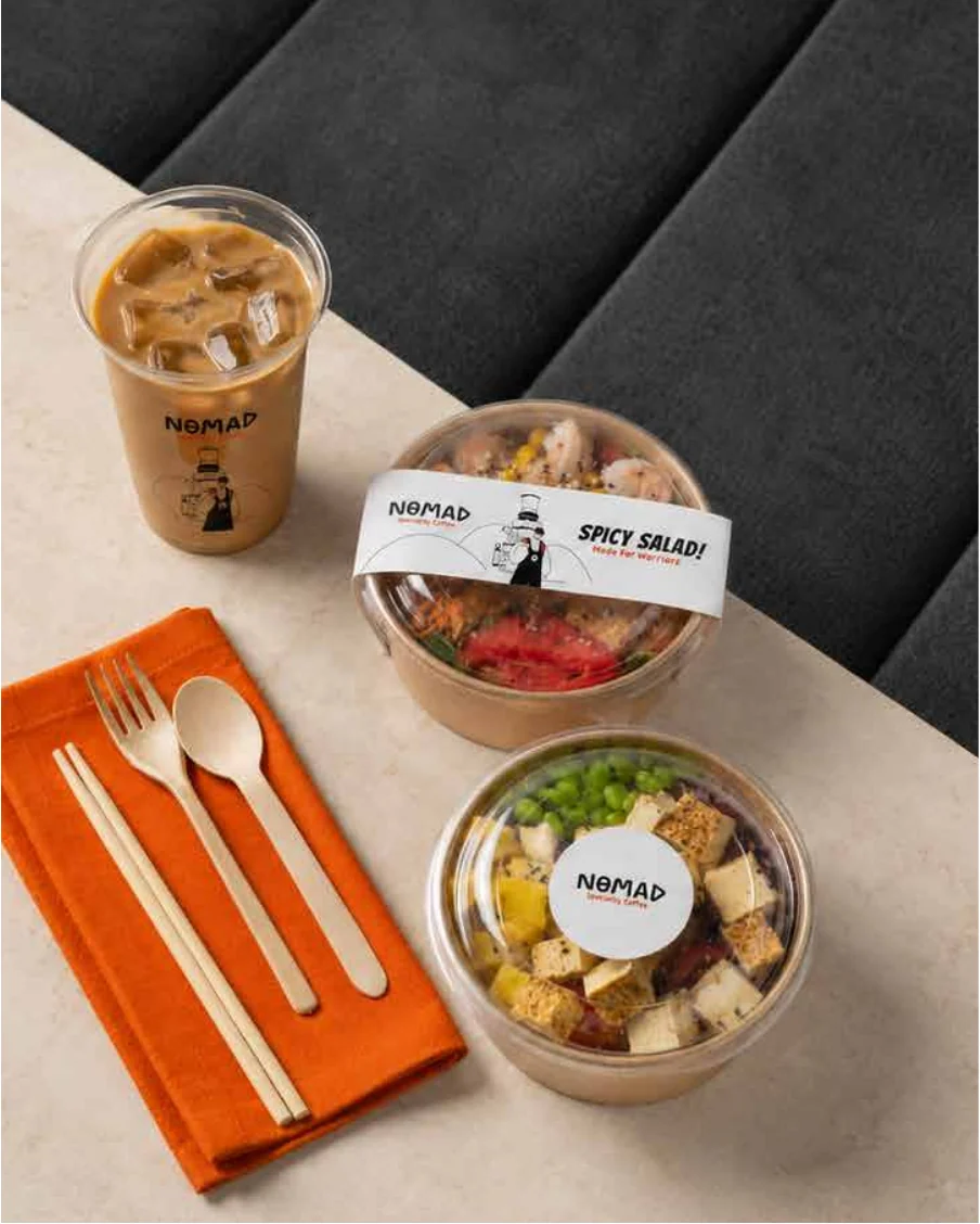
Alep shaped the brand as a visual world that could travel easily across different formats — from a coffee cup to a truck, frompackaging to uniforms, from a small illustration to a full physical experience.
The branding combines a bold wordmark, a character-led story, minimal line illustrations, and energetic orange accents to create asystem that feels adventurous, flexible, and instantly recognizable.
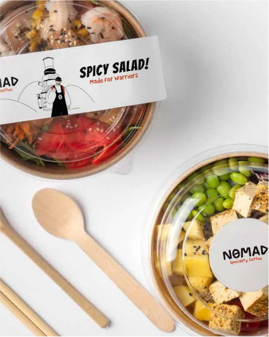
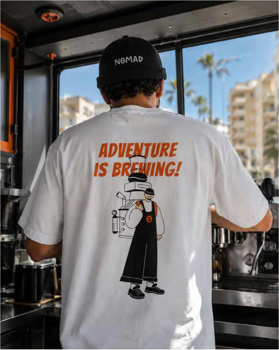
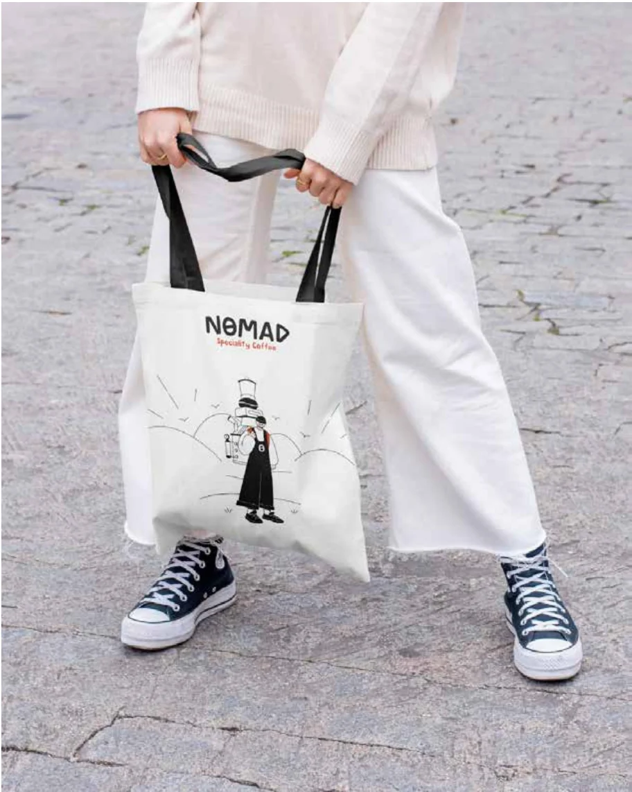
Rather than treating the character as decoration, Nomad became the center of the brand language. Hispresence gives the identity a human rhythm — making the brand feel less like a coffee service and morelike a world people can follow, carry, and remember.
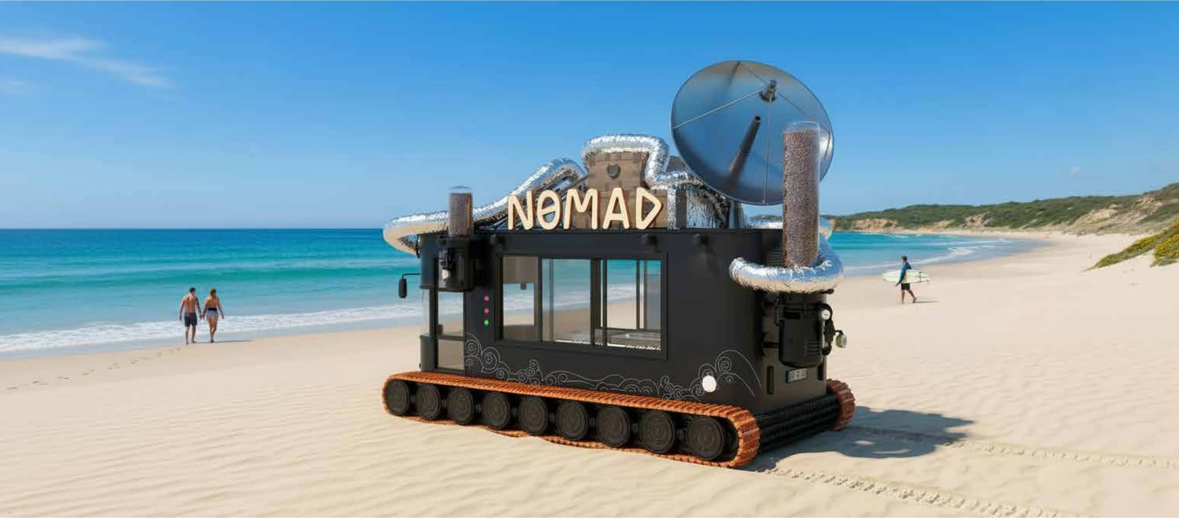
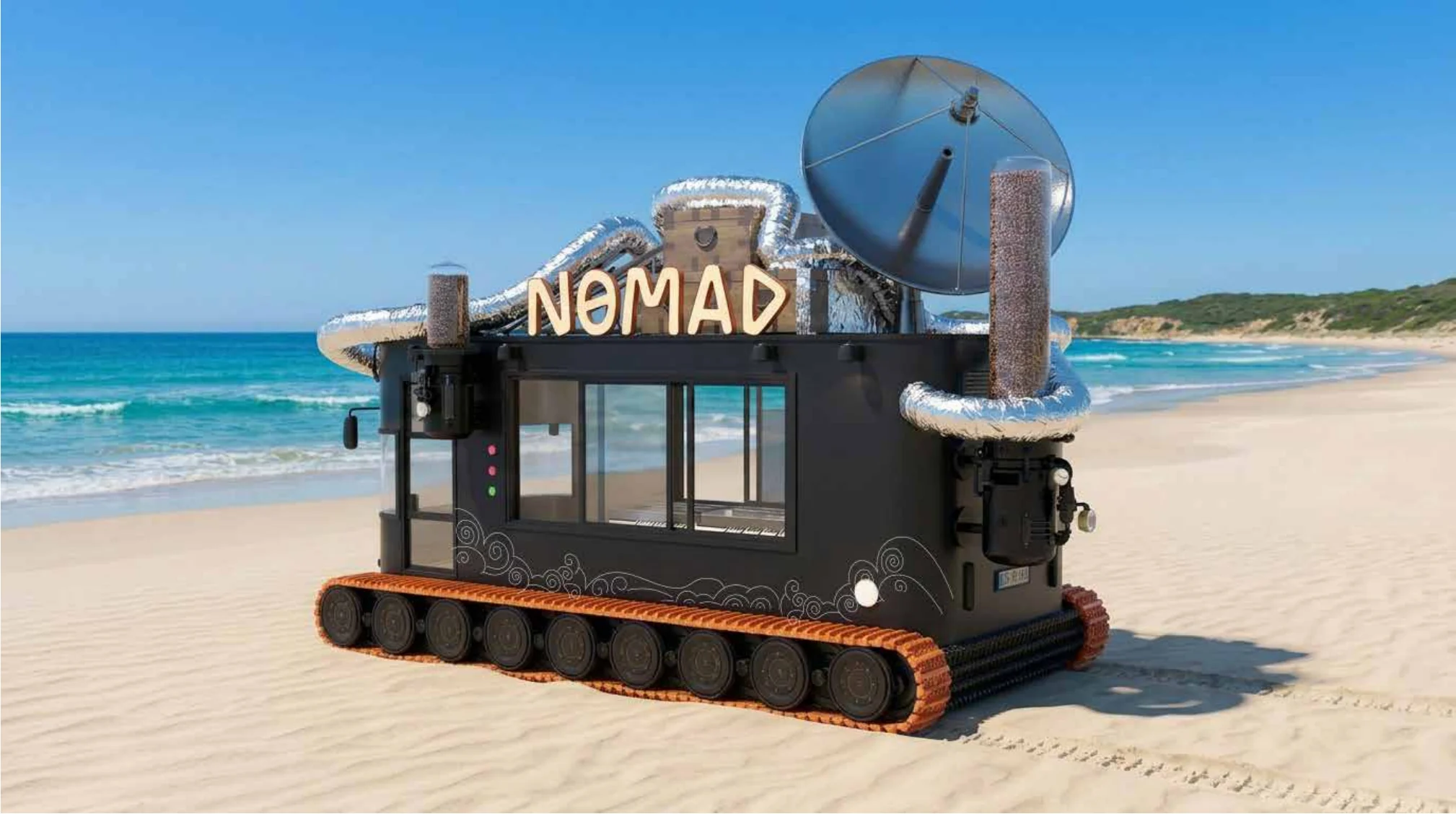
Designed with the spirit of an expedition vehicle, it carries the same adventurous identity into physicalspace — becoming a moving coffee experience that people can approach, remember, and return to.
Case.10 — Branding / Interior Design / User Experience
A specialty coffee brand built around adventure, movement, and a wider sense of community.
Nomad is a specialty coffee brand shaped around the spirit of travel, exploration, and everyday adventure.
Alep developed the brand identity and mobile experience around a simple idea: coffee can move with people. It can appear by the beach, on the road, in a gathering, or in the middle of a day that needs a new rhythm.
The brand was created as a complete world — a traveler, a machine, a visual language, and a mobile coffee unit designed to bring the experience wherever people are.
Design Narrative
The experience is built around movement.
Rather than creating a static coffee shop, Nomad was designed as a brand that travels. Its visual identity, character, packaging, and truck all carry the same sense of exploration — turning coffee into something more active, open, and memorable.
At the center of the brand is Nomad, a character shaped by adventure and curiosity. He is not just a mascot; he becomes the spirit of the brand — carrying the machine, the journey, and the energy of discovery with him.
Nomad’s illustrated world brings the brand to life through simple lines, open landscapes, and playful details.
The character, the coffee machine, and the surrounding scenery work together to create a world that feels light, adventurous, and easy to recognize.
The identity extends across cups, bags, trays, uniforms, merchandise, and takeaway items.
A restrained black-and-white system is lifted by bold orange accents, giving the brand a clear visual energy across every surface. Whether on a cup, a bag, or a t-shirt, the world remains unmistakably Nomad.
Alep shaped the brand as a visual world that could travel easily across different formats — from a coffee cup to a truck, from packaging to uniforms, from a small illustration to a full physical experience.
The branding combines a bold wordmark, a character-led story, minimal line illustrations, and energetic orange accents to create a system that feels adventurous, flexible, and instantly recognizable.
Rather than treating the character as decoration, Nomad became the center of the brand language. His presence gives the identity a human rhythm — making the brand feel less like a coffee service and more like a world people can follow, carry, and remember.
Designed with the spirit of an expedition vehicle, it carries the same adventurous identity into physical space — becoming a moving coffee experience that people can approach, remember, and return to.
Next case
Semiramis