
Case — Destination Branding · Environmental Graphics · Wayfinding
Baghdad Island.
A destination identity for a cultural leisure island shaped around gathering, play, nature, and celebration.
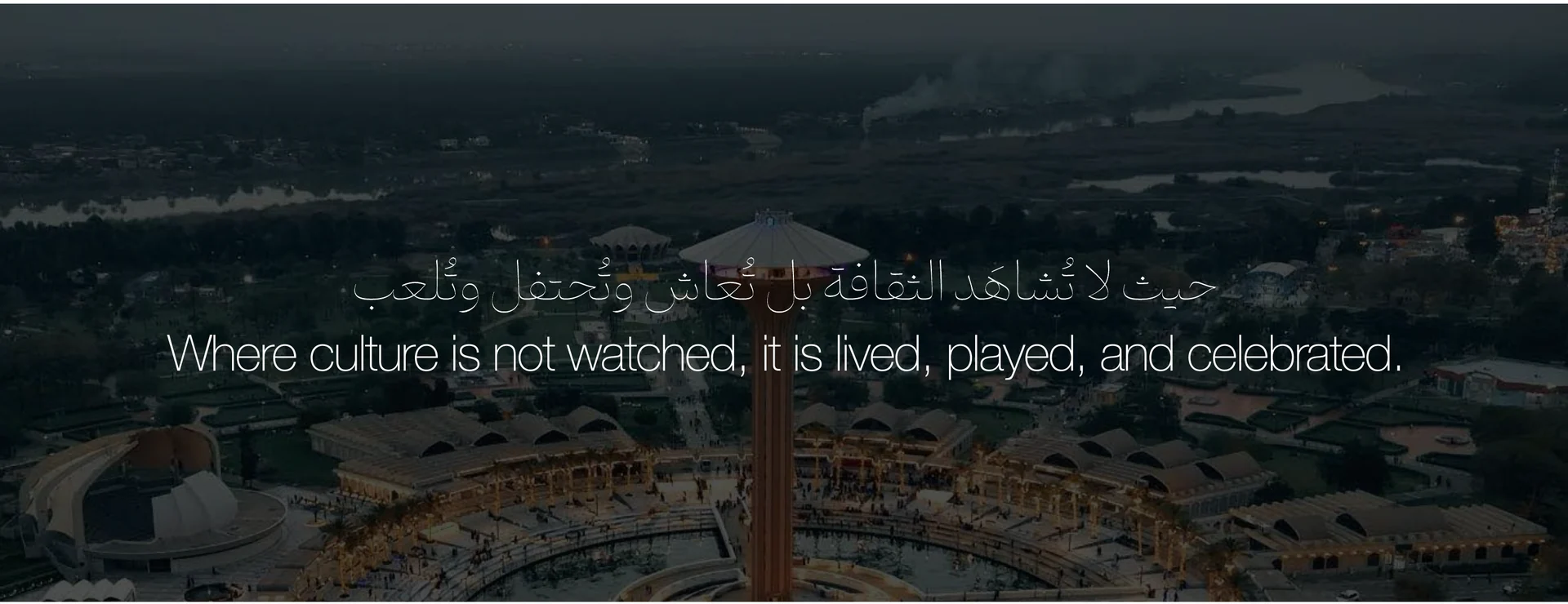
Baghdad Island is not only a place to visit. It is a destination where culture, entertainment, nature, family time,and public life come together.Alep developed the branding approach around one central idea: culture should not only be watched, it shouldbe lived, played, and celebrated.The identity was designed to give the island a clearer presence across its many touchpoints — from signageand campaigns to collaterals, uniforms, visitor moments, and the physical language of the destination.
Design Narrative
Baghdad Island is not only a park or entertainment place. It is a public destination where families, culture,nature, play, food, and everyday gathering meet.Alep’s role was to create a clearer identity for the island — one that could guide the experience, organizethe visual language, and make the destination feel more recognizable, lively, and connected to people.

The new Baghdad Island icon uplifts the familiar old mark while giving it a cleaner, more contemporary presence. Paired with a newlycalligraphed Arabic wordmark and a balanced English typeface, the identity feels more refined, local, and ready to live across signage,campaigns, and visitor touchpoints.
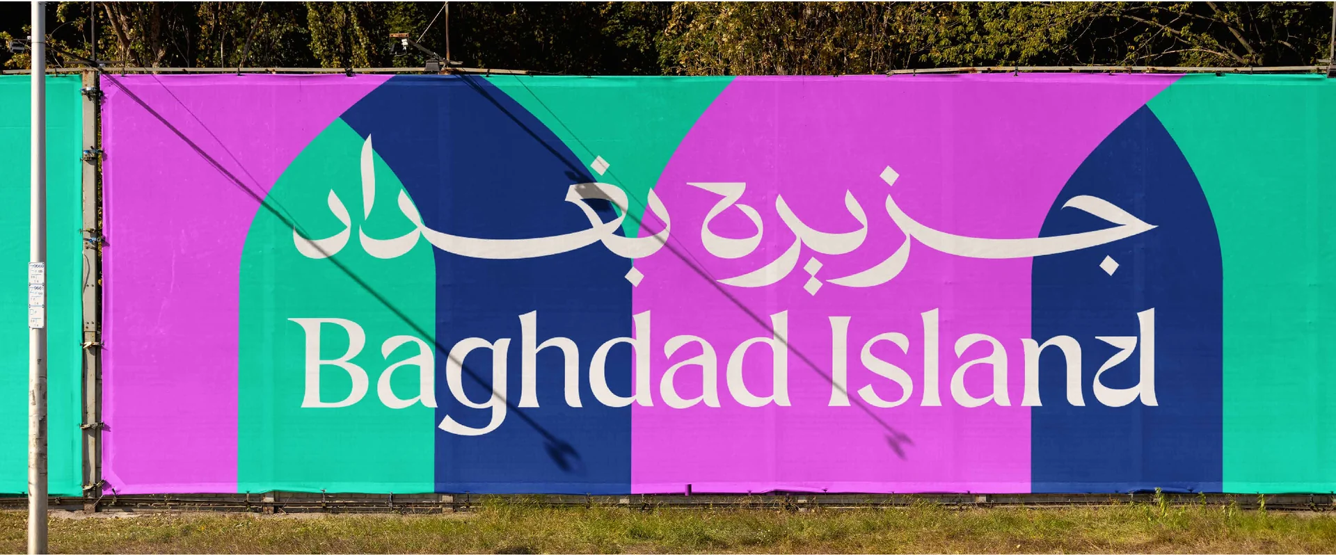
Baghdad Island’s visual identity was built from the character of the destination itself — its architecture, landscape, movement, andpublic life.The system translates these references into a clear destination language, using forms inspired by Baghdad’s architectural details andthe island’s own spatial rhythm. Across signage, billboards, and environmental applications, the identity becomes part of the place,helping the destination feel more recognizable, welcoming, and alive.Seen together for the first time, the applications show how the brand moves beyond a logo into a complete visual presence acrossthe island.

Island Green
River Blue
Celebration Pink
Warm Light
The color palette was built to balance the island’s natural identity with its public energy.Island Green and River Blue ground the system in the place itself — its greenery, water, openness, and sense of welcome. They givethe identity a calm and recognizable foundation.Celebration Pink and Warm Light bring the island to life. They add movement, joy, warmth, and a more playful layer to the visuallanguage, reflecting the moments of gathering, entertainment, and shared experience across the destination.Together, the palette creates a system that feels natural but lively — rooted in the island, yet full of color, rhythm, and human warmth.
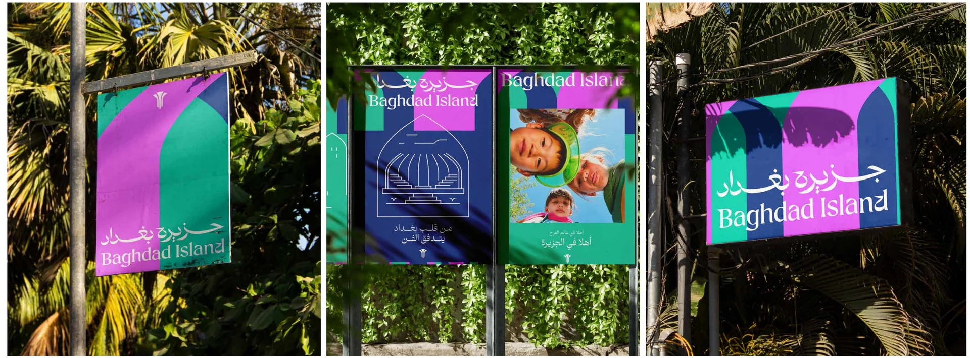
In the Landscape
Across banners, billboards, and environmental signs, Baghdad Island’s identity becomes part of the landscape. The system bringsvisibility, rhythm, and a clearer sense of place, helping the destination feel welcoming, recognizable, and alive throughout the visitorjourney.
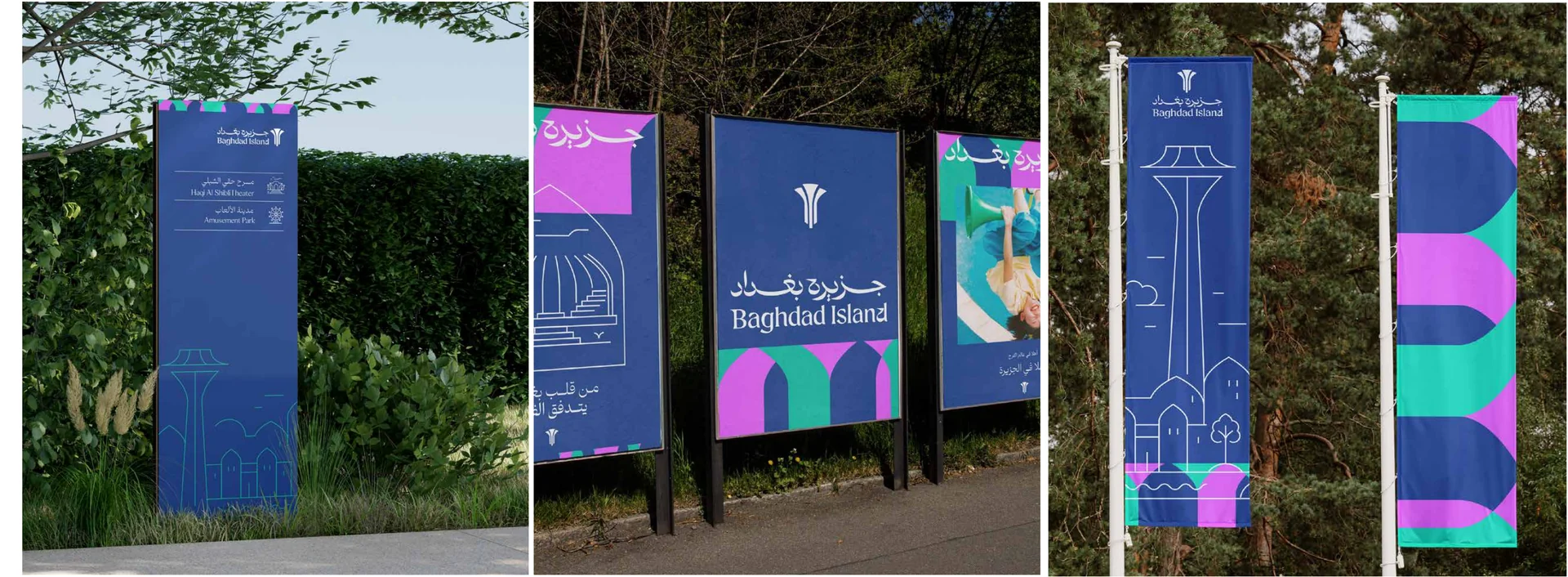
The signage system brings clarity to the visitor journey while keeping the identity present across the island.Directional panels, banners, and wayfinding elements guide people through attractions and gathering points,turning movement itself into part of the branded experience.
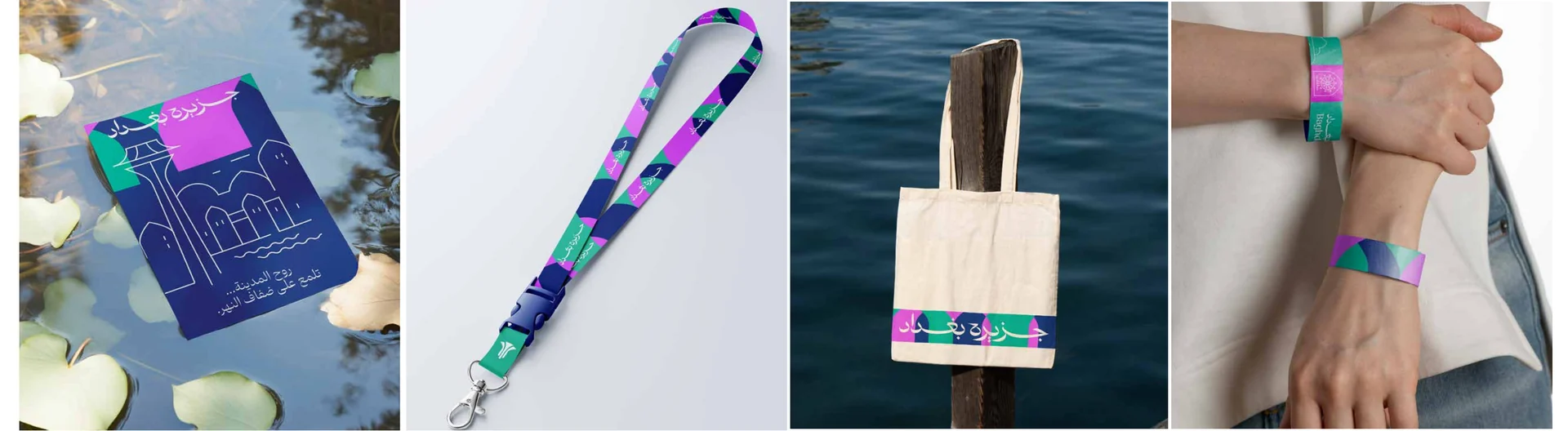
Visitor Touchpoints
The identity continues through the details people carry — tickets, lanyards, wristbands, bags, and visitor items. Thesetouchpoints extend the brand beyond signage, turning small interactions into part of the Baghdad Island experience.

The identity extends across uniforms, tickets, bags, mugs, bins, lanyards, and everyday visitor items. Each applicationcarries the same visual language, allowing Baghdad Island to feel consistent, recognizable, and present across bothguest experience and daily operation.
A Visible Destination
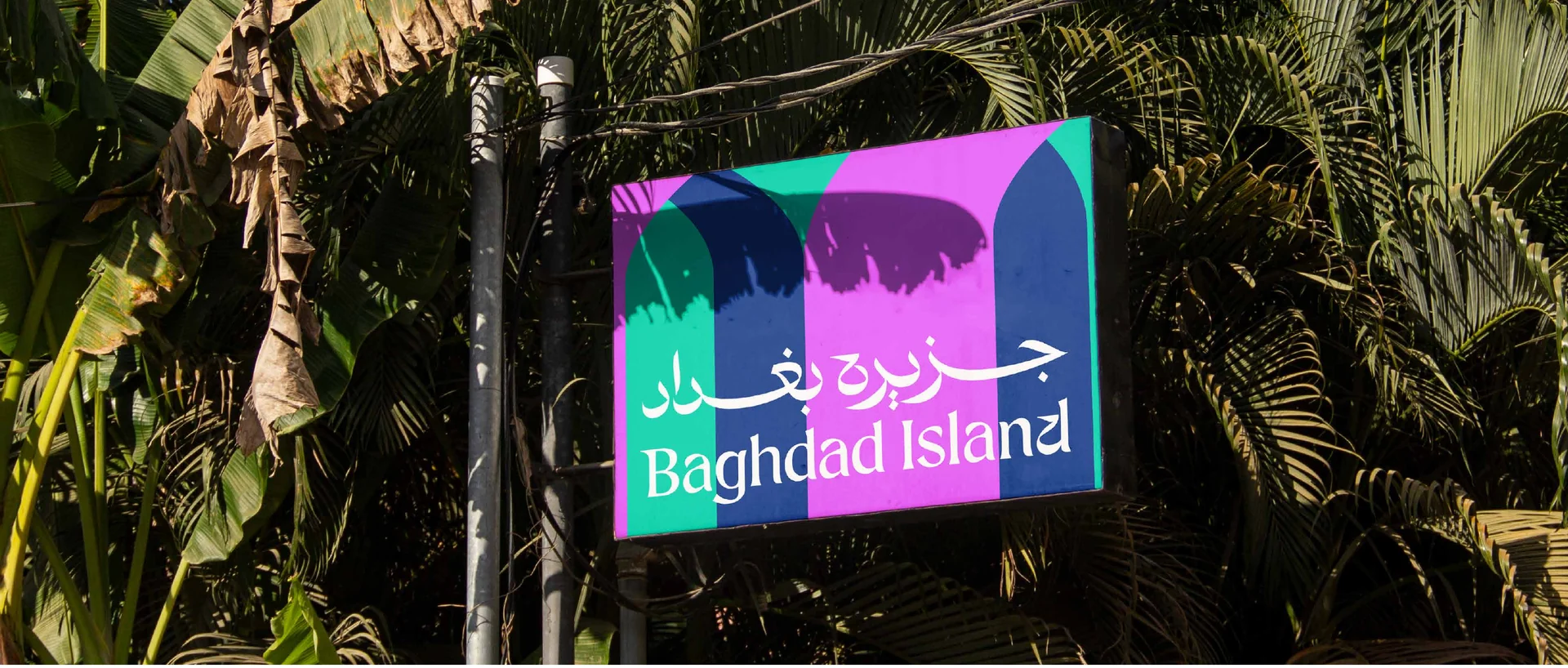
The identity expands across large-scale signs, billboards, and environmental graphics, giving Baghdad Island a strongerpresence throughout the landscape. These applications make the destination easier to recognize from a distance whileadding color, rhythm, and energy to the visitor journey.
Stories Across the Island

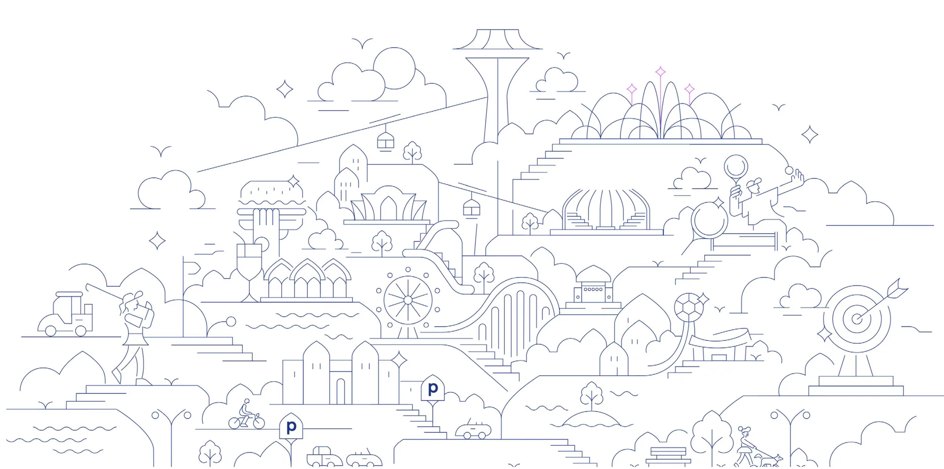
The communication system brings the island’s stories into a consistent visual language. Across campaigns,announcements, landmarks, and activity-led messages, photography, illustration, and bilingual layouts work togetherto keep Baghdad Island recognizable while showing the variety of experiences within it.
Next case
Molana